


One thing that keeps any Brand going is LOYALTY, which doesn’t come easily. Sometimes, the market is flooded with products as good as yours, and that is when things can get better or worse.
So, what is it that will make your brand stand out? Quality is definitely the first thing, and then the price, but what we often forget is the importance of product packaging design services that we choose.
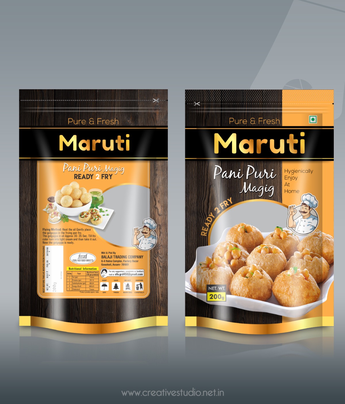
In today’s competitive world, FMCG sector is seeking for product packaging design services as to ensure the innovations occur every second and new ways of product packaging designs can be seen on the shelves every now and then. While we spend a lot of money on improvising the product, its quality and managing the pricing, we tend to underestimate the importance of the outer appearance.
Everything needs to be INSTAGRAM-ready- the food at the restaurant, the parties you host, the clothes you wear; then why not the products of your company?
So, here is your short and crisp guide to some product packaging ideas that have worked over the years and are relevant even today!
- Customer Easeness
When a customer gets attracted from the packaging, your product will definitely stand out.
For example, Johnson & Johnson changed their complete packaging globally by adding pump caps. This was because these caps enable the user to easily dispense the baby lotion or shampoo with one hand while the parent can keep the other hand on the child.

Another example could be when the packaging doubles up as storage- Kellogg’s had boxes and packets but they later added zip locks. The packet now doubles up as storage and the consumer does not have to buy a separate container for the cereal.
This makes life easier and also helps promote “sustainable living”, which has become an extremely important issue today. This has led to the growing demand for eco-friendly packaging.
- Blending Human Psychology
The human psychology is extremely complex.
Designing the packaging after understanding these complexities will help attract customers.
The design might be unique but an unattractive color scheme will not appeal to the public.
Therefore, the right kind of color scheme is extremely important that will highlight the brand name and the brand logo as well.
For instance, we think of a particular shade of red the moment someone talks about coke, or the yellow packet with the red brand logo when we talk about Maggi. Use the colors help in connecting with the brand name.
- Simplicity of the Packaging Design Elements
Today, it is the simplest of designs that are standing out. We are all starting to believe in the Japanese way of minimalistic living.

Let’s take the example of “Paperboat” product packaging idea. They come in standee pouches with a paper-like texture that has a link to the brand name.
Their idea was to simply give everyone the experience of squeezing the fruit into the mouth, like we all did as kids. This simple idea with a plain white background and bright colored caps has definitely done its job.
The product packaging design can be simple but it must ensure that the consumer uses the product with pride by making a striking impression.
- Illustrations
The visual graphic design on the packet plays an extremely important role because one starts connecting to it over a period of time.
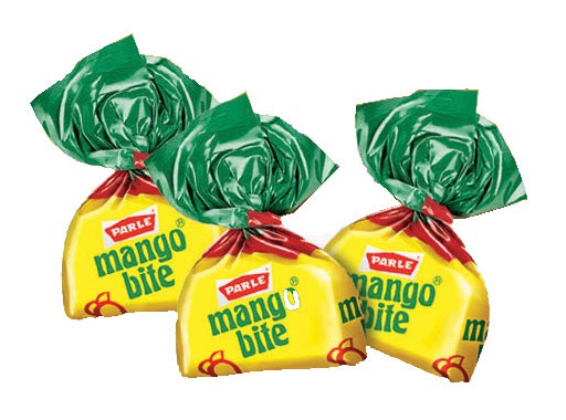
![]()
The best example that we can talk about is the illustration of a girl on the Amul Butter packets. It is a simple and extremely old image but she sure has gone places and the entire nation can connect with her.
The illustration also radiates a good vibe that helps the consumer have a satisfying experience. So some are just buying emotions more than anything else.
The illustrations can be abstract, inspired by the past or just simple designs without stylistic elements. The product must harmoniously blend with its design.
- Unique Structural Design
This makes a product extremely different and can be easily marked in the crowded FMCG sector. It is challenging, creative and definitely raises the bar.

The egg-shaped Kinder Joy chocolate boxing makes every child want it more than the other chocolates that look alike.
The bright orange egg draws attention to itself and the kids can easily hold on to the egg with their tiny hands. Here, convenience key that easily attracts the target audience.
Old-fashioned packaging hides the products while consumers today like a sneak peek into what they are buying. Therefore, innovative structures and cuttings in the boxes help in this kind of interaction between the consumer and the product.
The packet is the first key to unlock a strong bond between the brand and the consumer. Hence, pack creatively!